Blog / News
Introducing a way better editor (but still minimal)
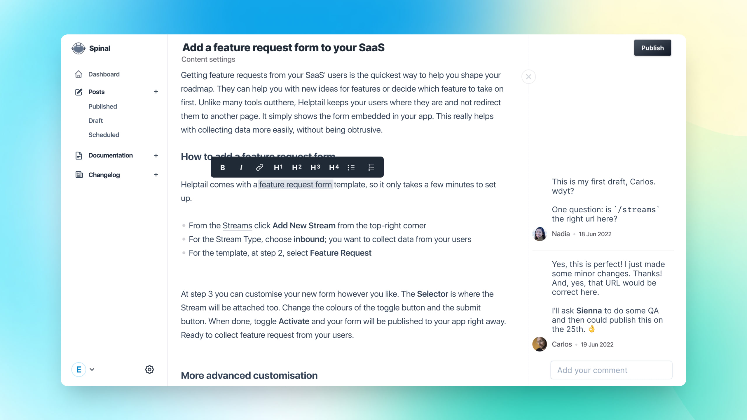
A complete new, better, but still minimal editor is here. Read all about it.

From the very early start, Spinal had a minimal editor that put your content front and center. It worked really well. And I received many compliments about how simple it was to use.
But there were downsides too. The toolbar (the one you see when you select text) sometimes acted up. And also the extra step of previewing the transformed Markdown was not ideal.
So a few months ago, I started to iterate upon the editor. This was all done together with some of Spinal’s beta testers. I regularly pushed updates and gather feedback or went on one-on-one calls with them. This resulted in some amazing feedback. As such the editor is not the result of one developer or designer, but the work of actual Spinal customers! How cool is that?
The new editor merges the preview with the actual editor. So you see how your content’s markup (Markdown?) will look like in one go. No more: typing, going to preview, making tweaks, going back to preview, etc. But all in one go!
Read more details about the editor here
Even more power coming soon #
And that’s not all. The underlying technique that powers this new editor provides the foundation for many features that have been on the roadmap for quite some time (and that you’ll love, pinky-promise!). But I’m getting ahead of myself: that’s for another time.
For now: do enjoy this wonderful new editor, send your feedback and spread the word. ❤️
Published: (updated: )
Get all Spinal content in your inbox
Every first Thursday of the month, we'll send the latest about Spinal in your inbox. From product updates, articles and a little peek behind the scene of building a SaaS in 2025.
Get all the latest every first Thursday of the month. No spam. Unsubscribe at any time.